Making Simple Design That Works

Google Slide Deck
Illustrator | Powerpoint | Google Slides
I collaborated with a content creator to design a series of visually engaging decks for Google Cloud, showcasing their Data Marketplace and Analytics Hub. My focus was on translating complex technical information into compelling visuals.
To achieve this, I developed a unique visual style that blended abstract illustrations with Google's brand aesthetic. For the illustrations, I created a made-up environment that mixed humans and objects we use on a daily basis, with abstract data visualizations and UI elements we interact with on screen. This made the complex concepts more relatable and easier to understand.
I also streamlined the presentation by organizing the decks in Google Slides, optimizing each slide with concise text and impactful visuals. This approach ensured a clear and engaging message for the audience.
The client was incredibly satisfied with the initial deck, leading to further requests and a successful ongoing collaboration.
Web & Brand Design
Figma | Procreate | Photoshop
As the sole designer on this project for a high-end development company, I was tasked with establishing their website's visual identity. Working closely with the client, I developed a comprehensive brand guide, starting with a mood board and designing their key Engagement page to serve as a foundation for their internal team to build upon.
Through an iterative process of internal concept exploration and client presentations, we refined the visual direction. The goal was to evolve their existing brand while conveying a sense of exclusivity and sophistication befitting their target audience of large-scale commercial clients.
The final design incorporates a striking color palette of black, grey, and vibrant green, with geometric shapes strategically placed to guide user attention. The imagery features expansive landscapes and focused individuals, conveying a sense of authenticity and ambition. This approach successfully communicated the company's high-end positioning and provided a strong visual foundation for their website.
Illustrative Storyboards for Video
Illustrator | InDesign | FigJam | Procreate
Full videos linked below the description.
My work on Google Cloud storyboards exemplifies a collaborative and results-driven approach. I begin by partnering with project managers and art directors to brainstorm concepts, translating approved scripts into simple sketches. Iterative refinement follows, incorporating client feedback and visual inspiration from Google's brand guidelines and Pinterest. This meticulous process ensures the final illustrated storyboards effectively communicate the unique value propositions of Google's partners.
My contributions are consistently lauded by clients and colleagues, solidifying these storyboards as a highly valued and creatively fulfilling aspect of my work.
View Dinoct video here:
View Datastax video here:
View Astrix video here:
View Qdrant video here:
View Typeface video here:
Isometric Storyboards for Video
Illustrator | InDesign | FigJam | Adobe XD
View the video here:
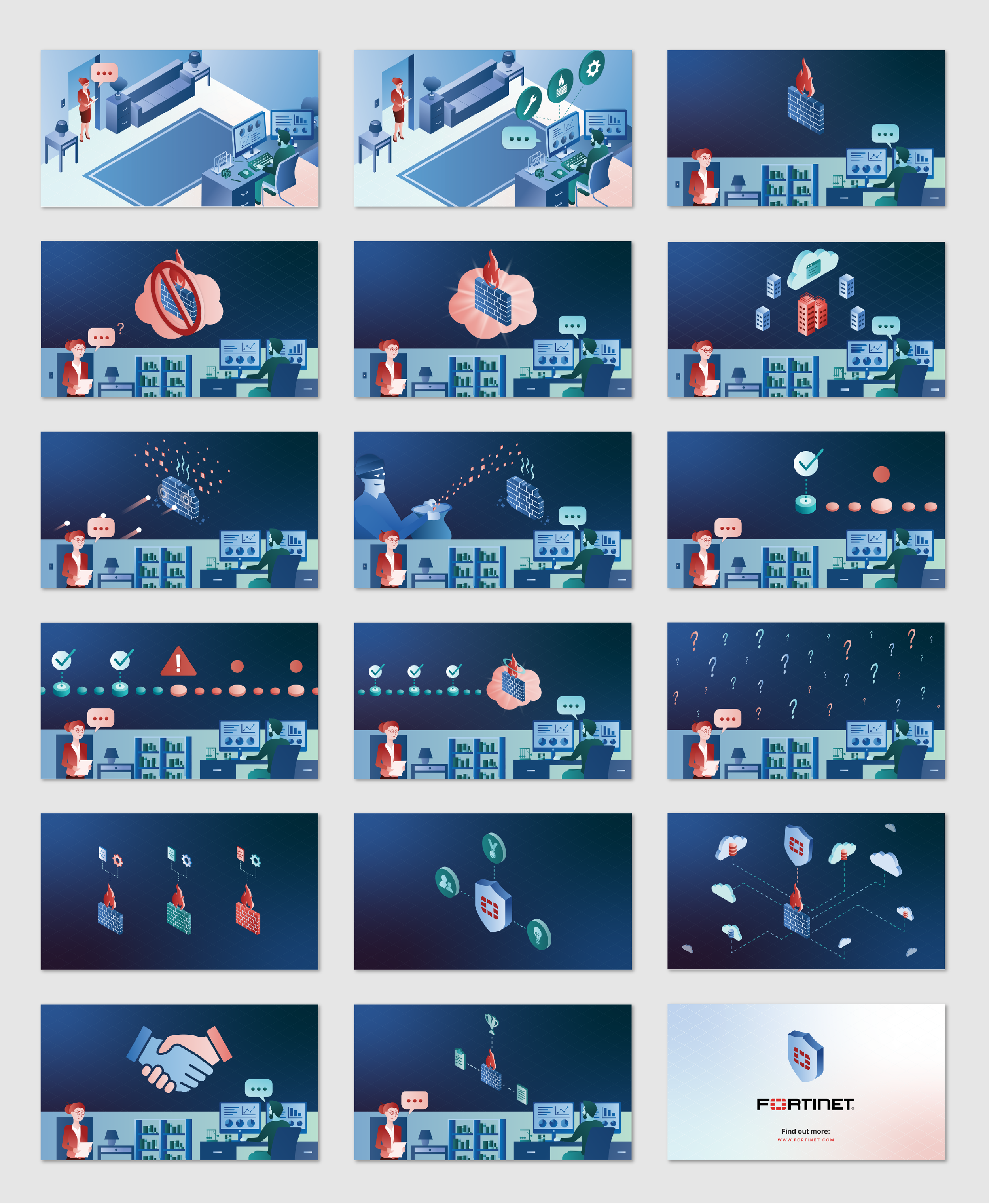
This project presented a unique challenge: to visually communicate the complex benefits of cloud migration with Fortinet's security solutions. The client's request for an isometric style immediately sparked an idea: to create a dynamic and engaging "city-scape" that would visually represent the customer's journey.
The initial concept involved visualizing the pre-migration state as a bustling city, potentially facing security threats and limited global reach. This "city" would then undergo a transformation, evolving into a secure and interconnected metropolis through cloud migration.
As the storyboard artist, I was responsible for translating the script into dynamic visual narratives within Illustrator. This involved creative ideation, ensuring the visuals effectively communicated the story, and managing the project timeline and budget to ensure a successful outcome. I also designed a landing page that drove traffic to this video.
Modular Illustration Deck
Illustrator | Powerpoint
To help the client help map out how their software would be used in different environments, I designed several modular isometric illustrations with Illustrator. With this PowerPoint, people, building elements, and AWS technology can be moved by clicking and dragging any of the elements shown on the right to the environment shown on the left. This allows the client to simulate different possible scenarios with the AWS technology implemented in airports, hotels, restaurants, and grocery stores.
The primary challenge in this project was designing isometric environments that were both instantly recognizable, clearly depicting restaurants, hotels, airports, and other designated building types, while also layering everything correctly in order to seamlessly accommodate the addition of new elements.
Infographic
Illustrator | Photoshop | Acrobat
Veritas sought an infographic to educate potential customers on the secure migration journey facilitated by their partnership with Microsoft Azure.
To address this need, I coordinated with our content write to design an engaging infographic that communicated key information through a combination of digestible content and dynamic visuals. Utilizing the distinctive elements of Veritas's brand–slightly slanted shapes, dynamic red gradients, and background highlight shapes–I crafted a visually compelling layout that was both easy to navigate and impactful.
The challenge was maintaining visual consistency while introducing subtle variations in each section to keep the reader engaged. By carefully balancing visual hierarchy and dynamic elements, I created an infographic that effectively guided the reader through the secure migration journey offered by Veritas and Microsoft Azure.
Isometric Storyboard
Illustrator | InDesign | Figjam | Procreate
This was a video that presents the challenges of security firewalls, with two central characters having back and forth conversations on unique challenges in the marketplace and how this specific Fortinet software can provide a solution.
The challenge was that the client wanted us to give life to the characters with their office personas, while also having supplementary visuals that support the subject matter of their discussion; all while designing in an isometric landscape. To solve this, I designed a side panel in a traditional 2D landscape that shows the two personas conversating, and shifted the isometric supplementary visuals to the left or right. This
Presentation Deck
Powerpoint | Photoshop | Illustrator
Shortly after Guardian Fall Protection was acquired by Pure Safety Group, I was tasked with developing a presentation deck for our executive team. This deck aimed to showcase the unique product offerings of Guardian Fall Protection, Checkmate, and Ty-Flot within the broader Pure Safety Group portfolio.
Working closely with project managers and executives under a tight deadline, I gathered key objectives for each slide. I then developed compelling visuals that effectively communicated the timeline for product releases, introduced the new executive leadership team, articulated the company's new brand promise, highlighted our service areas, and outlined our strategic roadmap.
The primary challenge was to effectively demonstrate the individuality of each company while also emphasizing their collective role as integral components of the comprehensive Pure Safety Group product offering.
Bucket Insert
Illustrator | Acrobat
Construction workers working on residential roofs need to make sure they are properly using the appropriate equipment for each particular roofing scenario.
This is a both an insert and digital graphic I created that comes inside the "Bucket of Safe-Tie", a top-selling kit sold in a bucket by Guardian Fall Protection that includes all the fall protection equipment a resident would need (a full-body harness, a vertical lifeline assembly, and a Temper anchorage connector) to safely make repairs on their roof. It is a double-sided, easy-to-follow instructional document users can refer to when considering all potential fall hazards and how to prevent them using our gear.
Branding & Identity
Illustrator | InDesign | Photoshop | Sketching
Northwest Cleaners is a commercial-cleaning business located in Anacortes, WA. Rick wanted to separate himself from smaller, local house-cleaning business who had goofy, unprofessional, cartoon logos. He wanted a professional, trustworthy brand that would attract big companies throughout the Puget Sound looking for thorough cleaning services with luxurious equipment that smaller house-cleaning companies do not normally provide. I achieved this by making a sharp-lined, simplistic mark that resembles the Northwest with a large “NW” and having the ‘cleaning streaks’ of that broom look like trees. I capped the Northwest feel off by using a font inspired by the shapes of logs, complimented with a dark blue/bright green color scheme.
Branding & Identity
Illustrator | Sketching
Ommegang Brewery's Farmhouse Brown Ale is a bold and flavorful brew that will delight even the most discerning beer enthusiasts. This rich, hoppy ale offers a satisfyingly smooth finish.
To capture the essence of this robust beer, I designed a playful and quirky brand identity that reflects its bold character and pays homage to German drinking traditions. The core concept revolves around the idea of an "upside-down" experience, symbolizing the irresistible urge to quickly finish this exceptional beer. This playful notion is further emphasized by the "p" in "upside" cleverly turning upside down into a "b" for "brown," creating a unique and memorable brand story.
The logo is elegantly nestled within a bottle cap illustration, visually reinforcing the concept of an empty bottle. To evoke the festive spirit of German beer culture, I incorporated vibrant patterns and colors reminiscent of the iconic Oktoberfest celebrations. This playful and engaging brand identity effectively communicates the bold flavor and unique character of Ommegang's Farmhouse Brown Ale.
Branding & Identity
Illustrator | Photoshop | Sketching
Napoleon Fireplaces produce high-end electrical & natural fireplaces that look beautiful and make for a warm, cozy environment. They needed a re-brand that reflects that, aimed towards wealthy families with large, roomy homes. I created a connection between Napoleon Bonaparte and these fireplaces, displayed his story throughout the brand, and in a quirky way, gave the brand a feeling of luxury and warmth that their customers commonly experience.
Branding & Identity
Illustrator | Photoshop | Sketching
Sam had a very unique style as a photographer. Throughout the brand, I tried to keep it consistent with the dark, serious, thoughtful tone that his photographs portrayed. As he would be presenting this in front of potential employers and clients, I kept it as minimalist, clean, and to-the-point as I could. I wanted to connect who he is with what he does, and the most effective way I found to do this was by shaping his initials into the lens of a camera. In the end, the client and I were very pleased with the result. I captured the feel he wanted for his business.
Supergraphic & Van Wrap
Illustrator | Photoshop
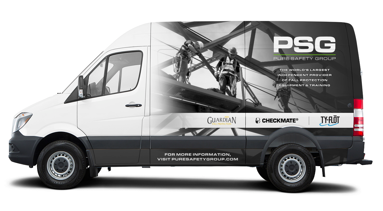
Following Guardian Fall Protection's acquisition by PSG in 2017, a comprehensive refresh of marketing materials was necessary to reflect the new corporate identity. My strategic approach centered on creating visually compelling graphics that emphasized our specialization in fall protection, aligning with PSG's position as the world's largest independent fall protection company.
The development of the Product Roadmap presented a valuable opportunity to showcase our most innovative and impactful upcoming products, each introducing groundbreaking advancements to the fall protection market. I designed the roadmap in two formats: a dynamic digital presentation and an impactful 30-foot wall display prominently featured at our headquarters, serving as a visual showcase for both potential business partners and employees.
PSG maintains a fleet of training vans strategically located across the nation, dedicated to educating workers on safe work practices at height. These vans prominently feature an impactful image depicting three workers confidently and securely utilizing our fall protection equipment, underscoring the importance of proper safety measures in high-risk environments.
Water Bottle Label
Illustrator | Photoshop
Bad Boys Northwest is an outdoor gear and supply company that embodies the rugged spirit of the Pacific Northwest, with a touch of irreverence. Their target audience comprises young to middle-aged men who share a deep appreciation for the Washington outdoors.
The brand collateral I developed for Bad Boys Northwest is both fun and distinctive, perfectly capturing the essence of their unique identity. My objective was to create visuals that instantly evoke the iconic imagery of the Washington Cascades and the lush evergreen forests, two defining features of this remarkable state. In my view, Washington's breathtaking natural beauty, characterized by its pristine landscapes and abundant freshwater resources, makes it the ideal representation of pure drinking water.